R4P3.net Dark Theme (Stylish)

Bluscream

Retired Staff
Contributor
Joined
May 8, 2015
Messages
967
Reaction score
934
Points
211
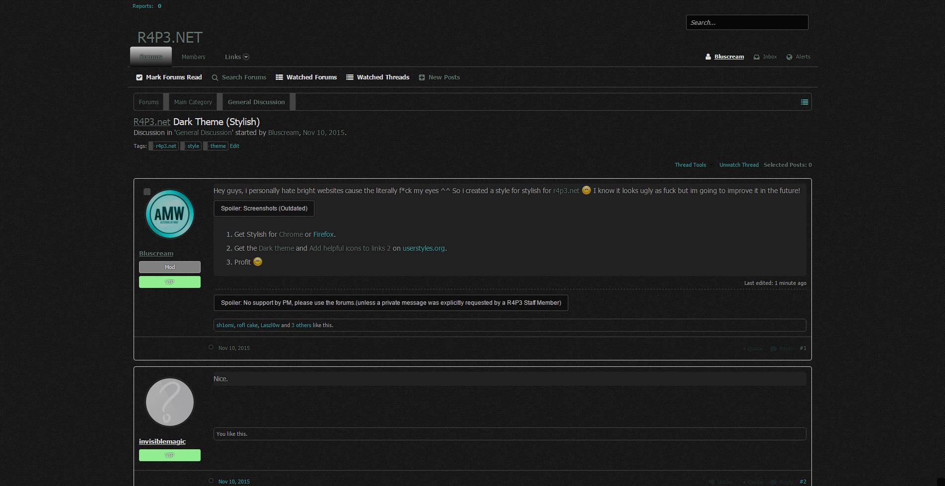
Hey guys, i personally hate bright websites cause the literally f*ck my eyes ^^ So i created a style for stylish for r4p3.net :) I know it looks ugly as fuck but im going to improve it in the future!
0843470879.jpg

4713853977.jpg
  1. Get Stylish for Chrome, Firefox, Opera or Safari.
  2. Get the Dark theme and Add helpful icons to links 2 on userstyles.org.
  3. Profit :)
0175627706.png
 
Last edited:
Joined
Sep 9, 2015
Messages
31
Reaction score
37
Points
50
The alerts tab, inbox, etc shouldn't be see through (in my opinion,) It makes it extremely hard to read due to the fact you can see everything behind (news).
 

Asphyxia

Owner
Administrator
Joined
Apr 25, 2015
Messages
1,846
Solutions
2
Reaction score
2,201
Points
327
I have yet to see a "professional" looking black/dark theme, in my opinion the whole dark/black/glossy themes are overrated. I used to be aboard the "Black Pirate Ship" although it has become so popular that it was mainstream. I would rather the executive/business/professional look than the creepy/scary/evil look. ;)

Go look at the front page of Facebook, Google and CNN.
 

Bluscream

Retired Staff
Contributor
Joined
May 8, 2015
Messages
967
Reaction score
934
Points
211
Okay. Maybe i've gone a *bit* too far xO

30f709cce9428f4ac4230925499d2136.gif
 
Top